How To Get Creative with a Website Design When All You’re Working With Is a Free Template
So you’ve launched your site on a budget, picked a free template, and now… it all looks the same as a hundred others. Don't worry—there’s still plenty of room to flex your creativity and make your site feel uniquely you without paying for custom code or premium themes. Here’s how to get clever with what you’ve got.
Step 1: Canva is Your Best Friend
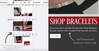
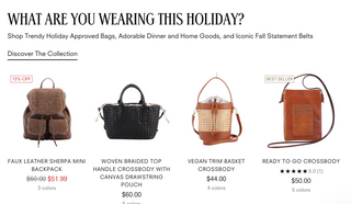
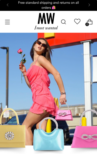
Let’s start with one of the biggest hacks: using full-width images as your layout tool. Most free templates don’t let you move blocks around freely or add fancy animations—but they do allow you to upload full-width images, often with hyperlink options. This is where Canva becomes your secret weapon.
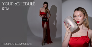
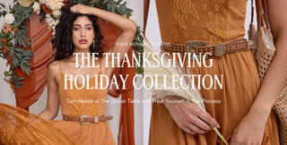
Design your own “fake” sections using Canva. Think banners that look like buttons, fake menus, text overlays, or call-to-action graphics. You can visually divide your image into blocks (e.g., a two-column layout with icons and text), play with perspective by making some images appear closer to the viewer than others, and then hyperlink the whole image—or just parts of it—to redirect users to specific pages. The result? It looks like your site is built with custom sections, but it’s actually just clever image work.
Pro tip: Match your image width to your template’s full-width spec so the edges don’t crop weirdly. Add a little spacing or padding around elements to keep things readable on both desktop and mobile.
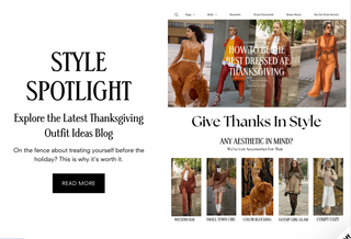
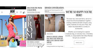
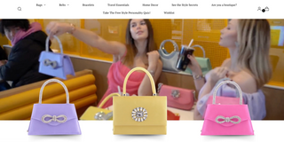
Step 2: Prioritize Easy User Experience over Dynamic Full Width Visuals
vs
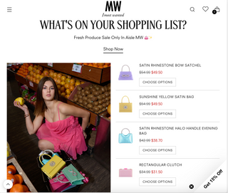
Ok, I know. We JUST said use Canva to make full width images. But there’s a careful balance. Sometimes, your visual storytelling should span across the page and sometimes you should still use images, but leave enough white color or empty space in between so that scrollers can actually click on individual icons/collections and interact with your site. (Or put them lower beneath your product assortment selection.) User interaction leads to more orders and the more they feel your site is easy to navigate and click into, the better off your business is.
Step 3: Stick to a Color and Font Story
Free templates usually have limited font or color editing tools, so the best workaround is consistency. Use Canva (again!) or a free style guide tool to define your palette: pick 2-3 brand colors and stick to them. Same goes for fonts. Use Canva to design headers or section titles in your chosen typeface and upload them as image files.
This way, even if your template doesn’t support custom fonts, your brand still shines through in your visuals.
Step 4: Stack Your Layout Like a Magazine
Think of your site like a scrollable magazine. Use long-form vertical design: one section at a time, each with a bold purpose—hero image, about, services, testimonials, contact. With a little planning, each image section can have its own feel, yet still tie into a cohesive story.
Use whitespace strategically. Don’t cram content. Let each scroll feel intentional.
Step 5: Mobile-First Always
VS
Here’s the truth: a lot of your visitors are checking your site from their phones. That means your creative image layouts need to work just as well on mobile. Most free templates will allow alternate mobile images, so always preview your sections on mobile view if possible, and keep fonts big enough to read without pinching and zooming.
Use vertical spacing generously, and avoid placing clickable elements too close together (your users’ thumbs will thank you).
Step 6: Embrace the Footer Area
Most free templates give you access to a footer that appears on every page—so use it well. Treat it like your bonus round: add a second navigation menu, embed social media buttons, link to your blog or shop, or drop in a custom graphic with contact info.
Better yet, design a footer graphic in Canva that includes all this and upload it once—saving you time and coding headaches.
Step 7: Test, Tweak, and Get Feedback
Your first version isn’t your final version. Ask a few friends or peers to look at your site and give honest feedback. Do they understand where to click? Is anything confusing? Are any images slow to load? Use their insights to refine what you’ve built.
A good site isn’t just pretty—it’s functional and easy to navigate. And a free template doesn’t mean you can’t achieve that with some clever design moves.